Where are you going, where have you been?

 
39206537_10214972347241054_571397234969542656_n.jpg
 

When I meet someone for the first time, they already know who I am.

I used to feel surprised when someone read me accurately upon a first meeting, but I shouldn't have. My outfit was speaking for me, communicating my confidence in my choices, my sensitive nature, my fizzing intellect. It murmured my appreciation for beauty and romance. Everything I do, everything I am, is expressed in my wardrobe.

Strangers don't know the particulars of my life. What my childhood was like, whether I'm in love with someone, what moves me to tears, or how I take my tea. But they glimpse enough of me to know, almost immediately, if I resonate with them. Or not. Not is okay, too. There are other luminous, lovely people to meet in the world.

And first I had to meet myself.

I had to introduce myself to myself on a soul level, as if I were a new friend I had just made. Someone I knew nothing about other than a list of what she liked: butterflies, poetry, embroidery, and..? What does that mean? What speaks to her heart? What does she need the world to know about her? How does she crave to be seen?

That was the profound connection I needed to make, and I'm still making it, all of the time. The pattern on a blouse, the length of a dress, the shape of a neckline, all of these dilemmas are best explored hand in hand with the question: who am I, and how can I harmonize my inner self with my physical design? You can't change either, not really. But you can make peace with them - I did so contentedly. I learned that there are no consolation prizes. There is only you.

The truth is that it's easy to believe you'll make these soul introductions later, at some vague point in the future when you're magically equipped to do so. Don't wait.

Common Harmonizing Mistakes

The Dark Autumn Who Buys Soft Summer

Why would a Dark Autumn buy Soft Summer, you ask? Isn't it obvious that they're different? Well, yes. And no. What these two seasons have in common is that they are both the darkest of their parent seasons. They're smoky and earthy. Dark Autumn is the campfire at night, silhouetted against the dark trees, the inky sky, the surrounding dirt glowing amber in the dancing light. Soft Summer is the same campfire in the morning, the wood burned to ash, blued smoke rising from the drowned embers, pinkish glow of the sunrise illuminating the silvery green trees.

Okay, you say, those sound totally different. What's the problem?

No Dark Autumn shopping with her swatch book is going to pick up dusky rose, and neither is a Soft Summer going to head for burnt orange. Here's what they are going to confuse:

  • Navy

  • Teal

  • Pine Green

  • Brick Red

  • Gray

  • Black

  • Dark brown

Dark Autumn's navy is dark, somewhat bright: midsummer sky long after sundown. Soft Summer's navy is also dark, but carries an infusion of slate, a misty quality Dark Autumn doesn't have. Hide the blues and greens on your fan, and measure your navy by the warm colors. Dark Autumn’s will look heavy next to Soft Summer’s pinks and yellows, while Soft Summer’s will look hazy and cool next to Dark Autumn’s burgundies and mustards.

Dark Autumn’s teal is rich, with a green, almost aquatic undertone. Dark Autumn teal can be more blue or more green, but it will not be hazy or misty. Soft Summer’s teal is more blue, like Northern Atlantic waters, and the green undertone is more spruce than olive. Aside from the warmth, Dark Autumn’s teal is darker and brighter than Soft Summer’s, which will only reach medium darkness, and will remain soft.

Dark Autumn's pine green looks at home with dark garnet red. Soft Summer's looks at home with lamb's ears. Again, think fire vs ash.

Dark Autumn's brick red is intense. In fact, actual red bricks almost never look like this unless they are newly laid and darkened with rain. Soft Summer's brick red is dry, more rose than orange. It will look normal next to mauve.

Dark Autumn's gray has a patina to it, slightly olive, something wet to them like the red bricks. Soft Summer's gray carries a dove quality. It feels clean and cool, and looks normal next to dusty lavender.

Dark Autumn's black and brown are quite dark and spicy. The brown is like rich dark chocolate, carrying a hint of plum. The black is a little greened, like licorice. Soft Summer's black and brown are also reasonably dark, but less so. They've been washed many times, and look soft like flannel. The brown has a hint of rose, like the light on Venetian canals. The black is deep charcoal, smudged onto paper instead of opaque in the pencil.

The Brights Who Buy Light Summer Turquoise

I know. You're scratching your head, thinking, isn't Light Summer pastel? Why the heck would Bright Winter and Bright Spring buy a pastel?

The simple explanation is that while Light Summer is characterized by its lightness, there is still a range of darkness and brightness within the confines of the season We tend to picture Light Summer as faded Easter Eggs and scoops of ice cream, but like any other season, there's a reasonable scope. We see raspberry red, aquamarine, navy, amethyst. The only reason we don’t think of Light Summer as bright is that there are brighter seasons to compare it to: Bright Winter and Bright Spring.

Turquoise is particularly hard to tell apart in stores, and it's not unusual for Bright Winters and Springs to buy Light Summer's.  This turquoise feels sunny, aquatic, and fairly lightweight. It looks like sunshine and beaches, and looks normal next to most hot pinks. I'm looking at my poster pages for these three seasons right now, in fact, and each one has a square that looks exactly the same…that is, until you start moving them around. If I were to plop Bright Winter's turquoise into Light Summer's palette, it would suddenly become a dark square in the mosaic. We'd look only at that one square.

Despite Bright Winter and Light Summer both being cool seasons, I’ve found that Bright Springs tend to accidentally buy Light Summer’s turquoise more frequently than Bright Winters do. Compared to Bright Winter, Bright Spring is light. That lightness can make it difficult to tell whether you’re looking at the upper saturation and darkness of Light Summer turquoise, or a lower saturation and darkness of Bright Spring turquoise.

Shop with your swatch book spread out. Hide the aqua and turquoise strips: your eyes will fool you into matching them to the garment, even when you know better. Look at the lipstick colors next to the shirt. Would you wear them with that particular aqua? What if you'd wear one strip but not the other two? Nope, don't buy it. Look at your purples, your yellows, your greens: are they overpowering the shirt? Is your face going to walk in the room two steps before your shirt does?

My Thoughts On 12 Blueprints Cosmetics

After a Personal Color Analysis, the very first thing most of my clients do is this:

They buy makeup.

They stop at the drugstore on the way home, or they wait for my makeup list to show up in their inbox so they can carefully craft a shopping list.

So when Christine Scaman announced the 12 Blueprints Cosmetics, I was pretty excited. My clients are generally more enthused to shop for makeup post-PCA than anything else, especially if they've spent their lives wanting to wear it but not knowing what to buy.

I was also extremely skeptical. I'm picky about makeup. I want great colors, great pigment, great staying power, and great packaging. I had no interest in using, selling, or recommending makeup I didn't care for. I had the chance to see the makeup for myself when Rachel Nachmias and I traveled to Asheville together for drapings, and I was impressed. I went home and placed my own order.

I’d compare the 12 Blueprints quality to MAC. It’s a step above most drugstore brands, but it’s not quite high end, mostly due to packaging.

Here are my completely honest thoughts on the 12 Blueprints Cosmetics, divided by Color, Quality, Packaging, and the Bottom Line.

Color:

Surprise! The colors are top notch. There have been a couple duds, normal in the first stages of launching anything. A Light Spring lipstick was pulled because it looked like chalk on the lips, for example. Color is clearly the main draw here, and Christine hasn't disappointed. Some of these products are colors I've wanted to add to my studio kit for ages, but haven't been able to find easily, or I haven't been able to find in formulas that are cost-effective for studio use.

The blushes are a standout for me where color is concerned. Many seasons face underrepresentation in blush, and that problem is solved here. The winter blushes are particularly stunning. Bright Winter’s Enchantment is one of my favorites.

Always remember: no two women within the same season will wear their makeup exactly the same. While most seasons only have one blush available, there are multiple lipsticks listed for each season.

Quality:

I'm a blush fiend and the blush is pretty amazing. It reminds me of MAC’s classic powder blush. They're extremely pigmented, and finely-milled without being powdery. I find them easy to blend, with good color payoff.

Lipsticks come in several finishes and the quality is somewhat variable, depending upon your personal lipstick preferences. Some of the matte lipsticks can be quite dry, while others are creamy. The creme finish is lovely. My favorite is the high gloss, which gives a nice jeweled shine without looking wet or oily like a lipgloss.

A few of the autumn lipsticks have a fabulous metallic quality that can be hard to find without winding up in glitter bomb territory. I'm especially smitten with the True Autumn choice of Flame here, for example.

As for staying power, the range goes from good to awesome. I wore True Brit recently from about 11 a.m. to 7 p.m. and that's with eating, drinking, chatting, and probably biting my nails. It wasn't at full-strength that entire time, but nonetheless, I was impressed. I've had others wear off a little faster, but it just depends. In any case, they won't disappear quickly.

Lipsticks do have a slight scent, sort of a clean vanilla. I find them much more mellow than MAC, which smells too sweet and ice cream-y to me. However, I don't have any extreme scent sensitivities, so your mileage may vary.

Note that the lipsticks and glosses do contain lanolin, if you are sensitive to lanolin.

Packaging:

The packaging is quite cute, actually, black with a nautilus motif.

Lipstick comes in a semi-matte bullet which bears a striking resemblance to the standard NARS lipstick packaging. The bullets are lightweight and streamlined, also similar to the standard NARS, with a nonmagnetic closure. They look adorable when you whip one out of your purse to reapply.

Some colors are quite soft, and may be prone to breaking off at the base. Be careful not to twist the lipstick up too much before applying, or the pressure may cause the bullet to break.


L to R: Estee Lauder, NARS Audacious, 12 Blueprints, NARS, MAC, Revlon


Blush comes in a little plastic pot with a clear screw top. The screw top is a touch aggravating if you're used to snap containers, but it doesn't mis-thread. My main issue is that it's quite bulky, and the plastic portion of the lid sometimes falls out. The pot is similar in diameter to the Clinique Cheek Pop line, but a fair bit thicker with a slightly domed lid, and that makes storage bulkier than I'd like. I do appreciate that the top is clear, because I like to see my blush.


L: MAC Ambering Rose, 12 Blueprints Baha; R: Clinique Cola Pop, NARS Taos


L to R: MAC, 12 Blueprints, Clinique, NARS


The Bottom Line:

I’m a fan! I’ll be stocking them in my shop, and using them personally as well as in my studio. It’s great to have a line of colors that won’t be discontinued in 6 months, which as an analyst is highly irritating, because I prefer not to recommend discontinued items to clients. However, I will continue to also use other brands personally, as well as in my studio. I'll still be out there swatching makeup.

If you're really into the whole package of luxury cosmetics, these might not be what you're looking for. They're not intended to rival Tom Ford, no one's going to resell them on eBay for $50/pop, and the packaging isn't particularly thrilling.

But if you're looking for tried-and-true seasonal colors, a nice, reliable formula, and a reasonable price point, you're in the right place. Mine have found a comfy spot in my makeup stash.

My PCA Philosophy

I believe that everyone is beautiful.

I used to scoff at people who said things like that. I was convinced it was a pat on the head from the true beauties of the world, who felt badly for the rest of us.

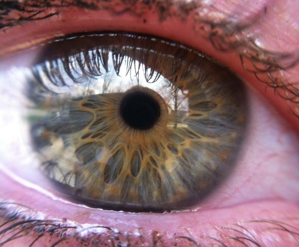
I had no idea that everyone's eyes were capable of glittering, the rind of the iris crisp and clear. Eye patterns? What's that? If you'd told me that an eye could contain spokes, webbing, or little stars, I'd have given you major side-eye. My awareness of eye color was limited to the information required for a driver's license: Blue, Green, Brown, maybe Hazel. I didn't know that an eye could resemble cracked aqua glass, or licorice nestled among moss.

 
This is the eye of my lovely friend Emily. Stunning.

This is the eye of my lovely friend Emily. Stunning.


I didn't know that hair color like dishwater blonde or mousy brown were mirages. I've seen ho-hum hair gain subtle highlights with the change of a drape. Hair that appears coated with baby powder against one drape is freshly-washed with the next.

I grew up on a media diet of airbrushing and Photoshop. I had no idea that rosacea, vitiligo, freckles, birthmarks, crow's feet, and other "imperfections" were no more imperfections than the texture caused by hammering silver.  I'd always found crow's feet particularly adorable, but in my mind they were something I found appealing in spite of their flawed nature.

I bought into my generation's truths about beauty and measured my worth against them.

In 7th grade a boy told me I had a big nose, so I spent over a decade assuming I'd get a nose job one day. I had a big gap between my front teeth, so I stopped smiling with my mouth open. I decided my breasts were too small, so I decided to wear push-up bras forever. I had naturally curly hair, so I woke up early every day to straighten it before school.

My daughter Simone is five. She's funny, empathetic, terrifyingly smart, and very pretty.

She has a gap between her teeth just like I do, and I think it's precious. She tells me that she loves the gap between her teeth because it makes her look like me.

At a bookstore last weekend, Simone was coloring at a table with another little girl. I heard the little girl ask Simone if she had lost a tooth. Without looking up from her picture, Simone said, "No, I just have a space between my teeth." The little girl passed her the sequins.

When you're sitting in my studio, I'm not interested in changing the architecture of your face, giving you paler skin or an artificial tan, fitting you into a fashion mold, or insisting that you need makeup to look your best. Makeup can be fun, but it's not necessary.

I believe that everyone is beautiful. Sometimes we just need help seeing it.